#before&after

Panorama Ski Condo Kitchen - Before & After


Panorama Ski Condo Kitchen - Before & After


Panorama Ski Condo Kitchen - Before & After

When space is at a premium, you need to be creative. And we had to really reimagine how the main living space in this ski condo in Panorama, British Columbia, could be configured to function better. 

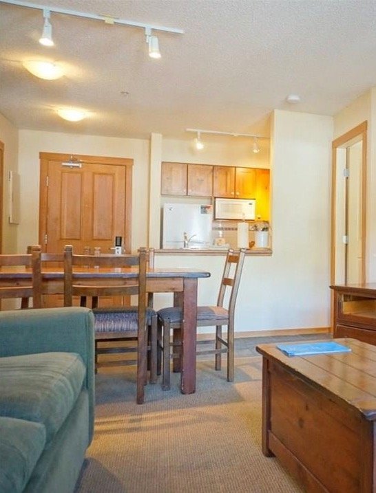
Previously, you entered the space and walked right into the dining table. You then had to walk around the dining table to get into the living space. We knew creating a better flow of traffic through an improved floor plan would be a huge part of this redesign. 

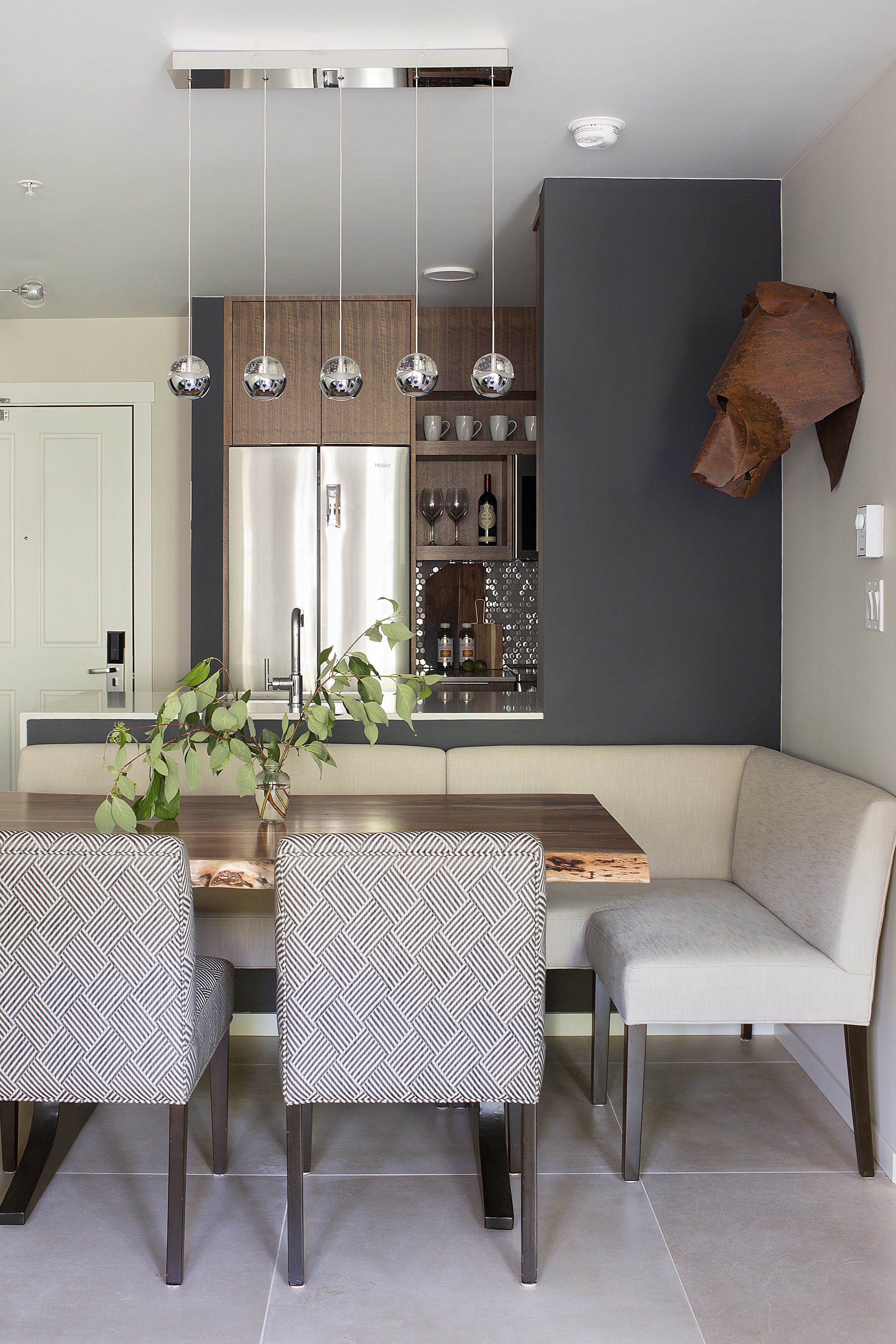
A standard builders kitchen also wasn’t providing much storage, custom cabinetry, banquette seating for up to eight and task lighting improved the overall function and vibe of the space. 

To keep with the condo’s mountain modern aesthetic, we added a little sparkle throughout the space with details like polished fixtures and tiles with a bit of sheen as a nod to the ice crystals and hoarfrost of the mountain town. 

Improved space plan

One of the biggest ways we made this space more functional was by relocating the door to the bedroom. This allowed us to open up the dining space and add banquette seating that can seat up to eight people, a huge improvement from the five of the original dining table. This also opened up floor space and greatly improved the flow of traffic in the whole space. 

Space-saving configuration in the kitchen 

Typically, with standard cabinet sizes you end up with a lot of dead space that gets filled with a filler strip. To avoid this and to maximize storage, we worked with a workshop to create custom cabinetry designed to specifically fit the space. 

We also added in two rollouts beside the dishwasher in the island for added storage and went for an integrated microwave hood fan over the stove to free up counter space. 

Lighting plan

Not only is layered lighting important for the actual function of a space, it goes a long way towards creating visual interest and adjusting a mood. 

In this space, we added task lighting over the dining table and under the cabinetry so there’s plenty of light in functional areas. We worked in some mood lighting with an arc lamp in the seating area to make things a little cozier for movie nights and early mornings. 

Need to elevate your own kitchen and dining area and create a more functional space? Give us a call.
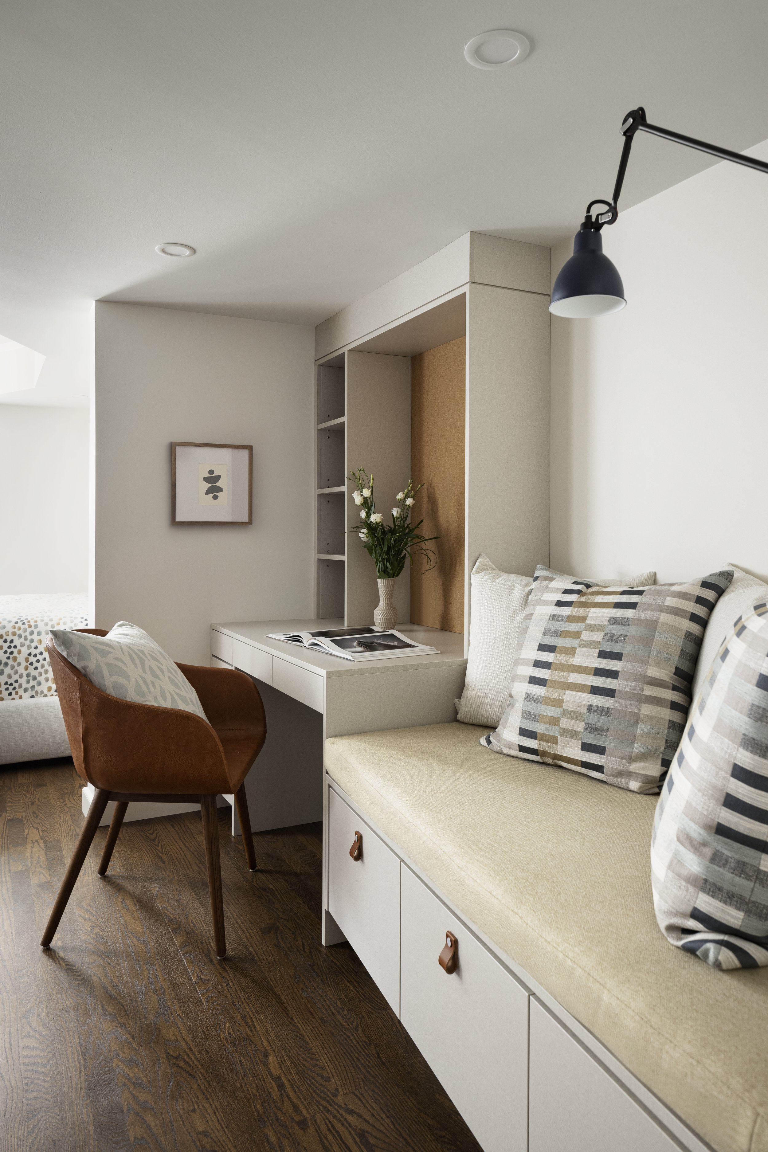
Rosedale Office Nook - Before & After 


Rosedale Office Nook - Before & After 


Rosedale Office Nook Before & After 

As a family grows over the years, their needs inside their home change, too. 

For this family in Calgary’s Rosedale neighbourhood, they found their space couldn’t keep up with their evolving family dynamic as the kids grew up. The owners also knew their needs would continue to evolve and they didn’t want to do another renovation in a few years.

We were hired to transform a walk-out basement into a contemporary flexible space that would create a new space for the teenagers in the house now and evolve with the family in the years to come. 

By adjusting the floor plan, adding in some multi-purpose furniture and improving the overall aesthetic, we were able to create an inviting flex space that the kids – and the entire family –  actually wanted to hang out in. 

New floor plan 

In order for this space to function better we had to completely reimagine the layout, including relocating the bathroom to create a better flow. 

We had a lot of constraints because of the physical structure of the home but we were able to work with some of the barriers to improve the function of the space, such as hiding support posts inside a stub wall to create a separate zone.

Desk and daybed for lounging and focused work

Given that this space will be heavily used by the teenagers in the house, we knew we needed to incorporate durable items. The desk is made from an embossed laminate panel so it’s nearly indestructible but still stylish. 

The daybed is a great multi-purpose piece that can be used socially as extra seating or easily accommodate overnight guests. 

Leather accents in pulls and chair

Incorporating leather accents worked really well with the contemporary aesthetic of the space and added an interesting design detail. Leather is also a practical fabric choice because it’s a forgiving surface that can absorb little nicks and marks over time. 

To learn more about this project check out our latest portfolio: Rosedale Modern.

Need help making a space better suit the needs of your family? Give us a call.